Skip to content
SourceLoop
Dashboards

How to Read the Ads Performance Dashboard

Tie spend on Google Ads, Meta, TikTok, LinkedIn, and Microsoft Ads to real conversions and revenue in one cross-platform reporting view.

On this page
  1. What the Ads Performance dashboard answers
  2. Step 1: Pick your filters
  3. Step 2: Read the metric tiles
  4. Step 3: Read the trend chart
  5. Step 4: Read the platform breakdown table
  6. Step 5: Read the attribution coverage indicator
  7. Step 6: Drill into Campaign, Ad Set, Ad, Keyword, Audience
  8. Step 7: Switch attribution models
  9. Step 8: Spot patterns that matter
  10. Step 9: Export and act
  11. What’s next

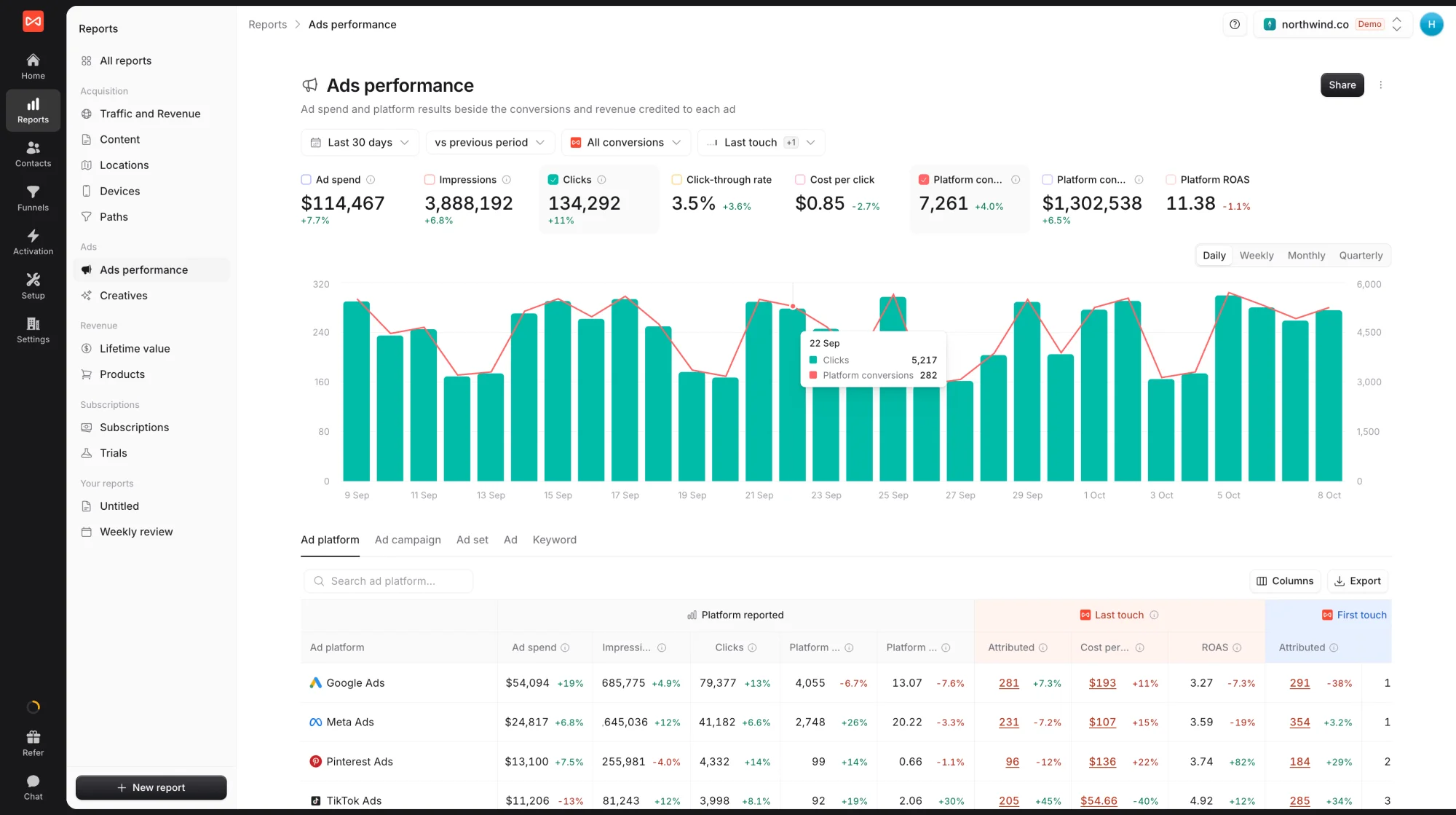
The Ads Performance dashboard is SourceLoop’s cross-platform paid-media view. It pulls spend and impressions from every connected ad platform (Google Ads, Meta, TikTok, Pinterest, LinkedIn, Microsoft / Bing) into one table and joins them against the conversions and revenue SourceLoop measured on your site.

If the Traffic dashboard tells you which channels brought visitors and the Paths dashboard tells you the conversion sequences they went through, the Ads Performance dashboard tells you whether your paid acquisition is actually paying back, with the most important metric for paid teams clearly visible in the top-right: ROAS.

What the Ads Performance dashboard answers

In one screen:

  • Total ad spend across every platform for the selected period
  • Whether your ROAS is improving or declining vs the previous period
  • Which platform produces the best CPA (spend per converted user)
  • How platform-reported numbers compare to SourceLoop’s measured truth (attribution coverage)
  • The week-by-week spend-to-conversion ratio (is efficiency holding or slipping?)
  • Drill-down to campaign / ad set / ad / keyword / audience without leaving the dashboard

It’s the right dashboard for the weekly paid-media stand-up, the quarterly board update on marketing efficiency, and the “should we keep spending on TikTok?” debate.

Step 1: Pick your filters

The filter bar across the top:

  1. Currency (USD by default in the screenshot) — pick the reporting currency you want everything converted into. Useful when you spend in multiple currencies; SourceLoop converts all rows to the same currency for like-for-like comparison.
  2. Filter — add ad-hoc filters
  3. All platforms — scope the dashboard to a single platform or a subset (just Google Ads + Meta, for example)
  4. Date range — defaults to the last 30 days
  5. All conversion types — scope to forms, meetings, chats, payments, or any combo

For ROAS-focused analysis, filter to payment conversions specifically. That’s the only conversion type that produces revenue, and ROAS becomes meaningful only when revenue is in the picture.

Step 2: Read the metric tiles

Six tiles run across the top, scoped to whatever filters you’ve applied:

  • Spend — total ad spend across all selected platforms (in your chosen reporting currency)
  • Impressions — total ads served, with period-over-period change
  • Clicks — total ad clicks, with period-over-period change
  • CTR — Clicks ÷ Impressions, the click-through rate
  • Conversions — SourceLoop-measured conversions from paid sessions
  • ROAS — Revenue ÷ Spend, expressed as a multiplier (6.77x means $6.77 of revenue per $1 spent)

Each tile shows a percent-change arrow. Green up + ROAS rising → your paid acquisition is getting more efficient. Red down + ROAS dropping → time to investigate which platform or campaign caused the regression.

SourceLoop Ads Performance dashboard showing metric tiles for Spend $23,901, Impressions 617.6K, Clicks 17.3K, CTR 2.80%, Conversions 867, ROAS 6.77x, plus a weekly bar chart with Spend (orange) and Conversions (blue) on dual axes

Click any tile to swap it onto the trend chart below. The chart supports two metrics simultaneously on dual y-axes, perfect for “spend (left axis) vs conversions (right axis)” comparisons.

Step 3: Read the trend chart

The chart shows your selected metrics over time, with Daily / Weekly / Monthly granularity. The default is Weekly, which is usually the right grain for ad performance, daily data is noisy, monthly hides timing.

The dual-axis design is the key feature here. Plot Spend (orange bars, left axis) against Conversions (blue bars, right axis), and look for weeks where the two diverge:

  • Spend rises but Conversions don’t follow → your auction prices climbed (or your creative fatigued) and you’re spending more for the same outcome. Investigate which platform contributed.
  • Conversions rise but Spend stays flat → an efficiency win; your ROAS just got better.
  • Both fall together → seasonal dip, or you paused campaigns; spend cuts often produce proportional conversion cuts.

Step 4: Read the platform breakdown table

The table below the chart is the workhorse view. The default tab is Platform, showing one row per connected ad platform (Google Ads, Meta, TikTok, Pinterest, Microsoft / Bing, LinkedIn) with the full performance columns.

Ads Performance dashboard table on the Platform tab showing Google Ads, Meta, TikTok, Pinterest, Microsoft/Bing, LinkedIn with Spend, Impressions, Clicks, CTR, CPC, CPM, and Conversions columns, plus 86% attribution coverage badge at top-right

Columns split into two groups:

Platform reported (data pulled from each platform’s API):

  • Spend — what the platform charged you
  • Impressions — ads served
  • Clicks — ad clicks
  • CTR — click-through rate
  • CPC — cost per click
  • CPM — cost per 1,000 impressions

SourceLoop measured (what actually happened on your site):

  • Conversions — the conversion count SourceLoop tied back to ad-driven sessions
  • CPA, ROAS, revenue when scrolled further right

The split matters. Platforms over-report conversions (view-through, cross-device modelling, last-click priors). SourceLoop measures what actually happened in the browser of a visitor on your site. Comparing the two columns side by side reveals how much of each platform’s “reported” performance is real on-site activity vs platform-side modelling.

Step 5: Read the attribution coverage indicator

Top-right of the table area, the attribution coverage indicator shows what percentage of platform-reported conversions SourceLoop was able to tie back to a real visitor session. The example shows 86%.

How to read it:

  • 90%+ coverage — excellent; the pixel is firing well across all paid landing pages
  • 70-90% coverage — normal; small gaps from privacy settings, ad blockers, and consent banners
  • Below 70% coverage — investigate; the tracking pixel may not be installed on every ad landing page, or there’s a CSP / cookie issue. Run the Verify the SourceLoop tracking pixel is installed flow.

Coverage is per-platform; click the badge to see which platforms have the lowest coverage. Often you’ll find that TikTok or Pinterest is the lower number because their in-app browsers strip more identifiers, which is informative for what level of confidence to apply to each platform’s conversion number.

Step 6: Drill into Campaign, Ad Set, Ad, Keyword, Audience

The seven tabs above the table let you drill from platform level down to the granularity that matters for your weekly decisions:

  • Platform — total per ad platform
  • Campaign — per-campaign performance across platforms
  • Ad Set (Meta) / Ad Group (Google) — the bidding level for most platforms
  • Ad — individual creative performance
  • Keyword — paid-search-specific keyword performance
  • Audience — Meta / LinkedIn audience-level performance

Each tab inherits the filters and date range from the top of the page. Use the Platform filter in the top bar to scope to a specific platform when drilling into Campaign / Ad / Keyword, otherwise the table mixes campaigns across platforms.

Step 7: Switch attribution models

The model selector top-right works the same as on the other dashboards. The default is Last Touch, which matches how most ad platforms report.

Two model switches that are particularly revealing for paid media:

  • First Touch — shows you which paid platform is the original discovery driver. Platforms that look weak on Last Touch but strong on First Touch are top-of-funnel assets. Cutting them based on Last Touch would crater your eventual conversion volume.
  • Linear — splits credit across every touch in the path. Useful for assigning fair “assist” credit to platforms that show up in winning multi-touch sequences (visible in the Paths dashboard) but never as the last click.

The attribution model also affects how Conversions and ROAS columns aggregate, so a campaign’s ROAS under Last Touch can look very different under Linear. Often the model that justifies paid spend is the multi-touch one.

For deep detail on each model, see Attribution models overview.

Step 8: Spot patterns that matter

A few useful reading patterns once data is on screen:

Highest spend ≠ highest ROAS → your largest budget allocation isn’t your most efficient channel. Look at the ROAS column. If a smaller-budget platform has higher ROAS, you have room to reallocate.

Very different platform-reported vs SourceLoop conversions → the platform’s modelling is overstating performance. Trust SourceLoop’s number for budget decisions; use the platform’s number only for bidding signal back to the platform.

Conversion volume up, but ROAS down → you’re growing absolute revenue but paying more per dollar of it. Common with aggressive scale-ups; whether it’s worth it depends on margin and lifetime value.

Attribution coverage below 70% on a specific platform → the SourceLoop tracker isn’t firing reliably on that platform’s landing pages. Fix tracking first before drawing conclusions.

A high-CTR but low-conversion campaign → great hook, weak landing page. Compare the landing page on the Content dashboard.

Step 9: Export and act

Top-right of the table, click Export to download the visible table as CSV. Typical follow-ups:

  • Weekly budget reallocation — sort by ROAS, shift dollars from the bottom half toward the top half within your overall budget envelope
  • Underperformer audit list — campaigns with low conversion rate and high spend → either fix the landing page or pause
  • Creative refresh queue — ads with declining CTR over the period → schedule fresh creative
  • Keyword cull — paid-search keywords with high spend and low conversions → negative-keyword them or pause
  • Coverage fix list — platforms with low attribution coverage → check pixel placement on their landing pages

What’s next

Frequently asked questions

  1. What does '86% attribution coverage' mean in the top-right?

    It's the percentage of platform-reported conversions that SourceLoop was able to attribute to a visitor session on your site. Higher is better, 90%+ is excellent, 70-90% is normal, below 70% suggests pixel issues or tracking gaps. Coverage is per-platform and per-period; click the badge for a breakdown by platform showing which ones have the lowest coverage.

  2. Why are 'Platform reported' columns separate from SourceLoop's conversion column?

    Platform reported numbers come directly from each ad platform's API (spend, impressions, clicks, CTR, CPC, CPM, and the platform's own conversion count). SourceLoop's conversion column is what SourceLoop actually measured on your site. The two often differ, Google Ads might report 200 conversions, SourceLoop measures 180. The gap shows you where the platforms are over-counting (e.g., view-through conversions, cross-device modelling) vs what really happened on your site.

  3. What's the difference between Conversions and ROAS?

    Conversions is the count of events. ROAS (Return on Ad Spend) is the revenue divided by the spend, expressed as a multiplier (6.77x means $6.77 of revenue per $1 of ad spend). ROAS is the headline number for ecommerce; for B2B / SaaS, Conversions (or CPA, calculated from spend / conversions) usually matters more because the revenue happens months after the click.

  4. Why is Meta's CPC so much lower than Google's in my report?

    Different auction dynamics. Google Ads is intent-driven, the visitor typed something specific into search; CPCs are higher but conversion rate is also higher. Meta is interest-targeted, lower CPC but typically lower per-click conversion rate. Comparing the two on CPC alone is misleading; compare on CPA (spend per converted user) or ROAS to see which actually pays back.

  5. Can I filter this dashboard to one ad platform?

    Yes. Use the 'All platforms' dropdown next to the date picker to scope the dashboard to a single platform (just Google Ads, just Meta, etc.). Useful when you want to deep-dive without the table being cluttered by platforms you don't care about for this analysis.

  6. Why does the trend chart show two metrics on different axes?

    The dual-axis design lets you compare a spend metric (left axis) against a return metric (right axis) on the same chart. The screenshot shows Spend (orange bars, left axis) and Conversions (blue bars, right axis). Useful for spotting weeks where you spent more but didn't get proportionally more conversions, that's where efficiency is dropping.

  7. My LinkedIn shows very few conversions but high spend. What does that mean?

    LinkedIn has the highest CPCs in the industry by far, that's normal. The right comparison isn't conversions per dollar; it's conversion value per dollar. LinkedIn often produces fewer but higher-value B2B leads. To check, switch the dashboard view to a longer time range and look at LinkedIn's revenue / ROAS column instead of raw conversions. If revenue justifies spend, you're fine. If not, that's an investment to revisit.

  8. How fresh is the ad spend data?

    Ad spend and impressions refresh once daily at 05:00 UTC (with a 14-day re-sync window to catch the ad platforms' late attribution adjustments). Conversion data measured by SourceLoop appears within seconds. So spend is up-to-yesterday, conversions are up-to-this-second, the dashboard reconciles both per period you've picked.

Track every conversion to its true source

Capture and send full attribution data from every signup, lead, booking, and sale to your CRM and ad platforms, so you know exactly what's driving revenue.

Without SourceLoop

Untagged

Kayden Floyd

kayden@abc.com

  • SourceUnknown
  • MediumUnknown
  • CampaignUnknown
  • Landing pageUnknown
Journey
No touchpoints captured

With SourceLoop

Auto-tagged

Kayden Floyd

kayden@abc.com · Acme Co.

  • Channel Paid Social
  • CampaignFree_demo
  • Landing page/pricing
Journey
Synced to HubSpot Google Ads Meta