How to Read the SourceLoop Locations Dashboard
Walk through the Locations dashboard, the geographic attribution view that shows which countries, regions, and cities convert into leads, meetings, chats, and revenue.
On this page
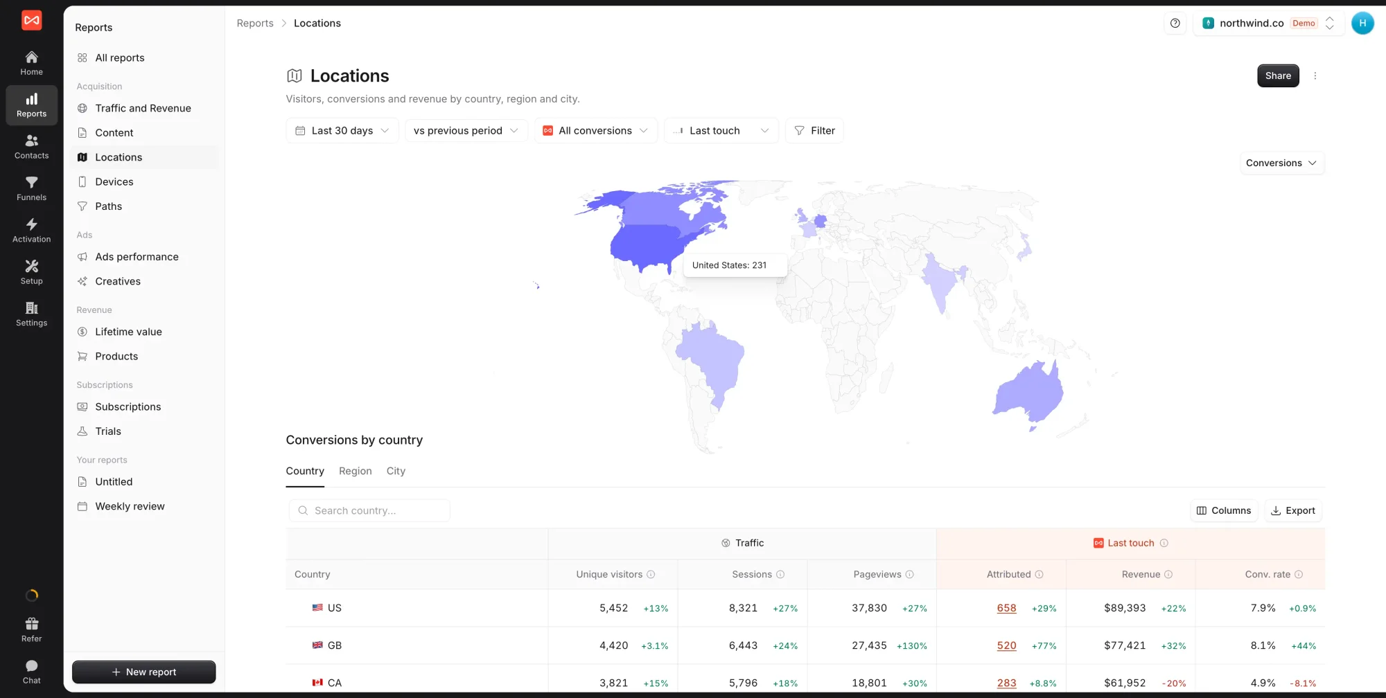
The Locations dashboard is SourceLoop’s geographic attribution view. It groups every session and conversion by the visitor’s country, region (state or province), or city, so you can see where your most valuable audiences actually live.
If the Traffic dashboard tells you which channels brought visitors and the Content dashboard tells you which pages they landed on, the Locations dashboard tells you the geography behind both, useful for international expansion decisions, geo-targeted ad spend, and country-specific content investment.
What the Locations dashboard answers
In one screen:
- Which countries are your top conversion markets (by count and by rate)
- Whether you’re under- or over-spending in a specific country relative to its conversion volume
- Which regions inside a country drive the most leads (e.g., is your California-targeting paid social actually pulling LA + SF, or one of them?)
- Which cities have the highest revenue concentration (when payment integrations are connected)
- Where your conversion mix changes (a country where chat dominates vs. one where forms do)
It’s the right dashboard for international expansion planning, geo-targeted ad campaign decisions, and figuring out whether a specific market deserves localised content.
Step 1: Pick your filters
Same filter bar as every other dashboard:
- Date range — defaults to the last 30 days
- Conversion type — all conversions, or scope to forms / meetings / chats / payments
- Attribution model — defaults to Last Touch
- Filter — add ad-hoc filters on channel, source, campaign, device, country, etc.
For geographic analysis specifically, two patterns are particularly useful:
- Filter by Channel = Organic Search to see which countries find you via SEO
- Filter by Channel = Paid Search or Paid Social to see whether your paid spend is reaching the geographies you targeted
Step 2: Read the stacked-bar chart
Unlike the Traffic and Content dashboards (which show a time-series chart at the top), the Locations dashboard leads with a stacked bar chart grouped by location. Each bar is a country (or region or city, depending on tab), and the bar is segmented by conversion type, Web Form, Meeting, Chat, Payment.
This view is the fastest way to spot a few things:
- Which countries dominate your conversion volume at a glance (the tallest bars)
- Whether the conversion mix shifts by country (e.g., the US is heavily Web Form, while the UK has a higher proportion of Meeting bookings, which usually means a different sales motion is working there)
- Where the long tail starts (after the top 5-10 countries, do you have meaningful volume or is it noise?)
Above the chart, the metric selector lets you swap what’s being plotted. Defaults to Conversions by Country; switch to:
- Visitors by Country — raw audience size
- Sessions by Country — visit volume
- Pageviews by Country — content consumption
- Revenue by Country — dollar-weighted, when payment integrations are connected
- Conv. Rate by Country — efficiency rather than volume
To the right of the metric selector, three icons let you flip between bar chart, horizontal bar chart, and pie / donut visualisations of the same data.
Step 3: Switch grouping with the tabs
Below the chart, the table area has three tabs:
- Country — the default; ISO country code with flag emoji
- Region — state or province inside a country (e.g., California, Ontario, Bavaria)
- City — major metros (e.g., London, New York, Sydney)
The chart at the top of the dashboard updates to match whichever tab you’ve selected. So picking the Region tab shows a bar chart of conversions by region, and so on.
The table itself shows the same six metric columns as every other dashboard, scoped to the location:
- Visitors
- Sessions
- Pageviews
- Conversions (highlighted in orange so it’s easy to spot at a glance)
- Conv. Rate
- Revenue (when payments are connected)
Country rows have a flag emoji prefix for instant recognition; region rows show the region name with the parent country flag; city rows show the city name with country flag.
Click any row to drill in. The filter bar updates to scope the entire dashboard to that location, so clicking on the US row in the Country tab and then switching to the City tab shows just US cities.
Step 4: Compare two periods
The Compare toggle in the top-right of the table area (next to the visualisation icons) adds a comparison column showing the same metric for the previous period. Useful for:
- Tracking geo-expansion — did the country you opened a new market in actually grow conversions this period vs last?
- Spotting decline early — a country whose conversions dropped 30% period-over-period is worth investigating before it’s a year-over-year problem
- Validating geo-targeting changes — did tightening your Google Ads targeting to North America actually reduce non-target conversions as planned?
Step 5: Switch attribution models
The model selector top-right works the same as on the other dashboards. For geographic analysis specifically, two model switches are particularly revealing:
- First Touch by Country shows you which countries originally discovered you. Often differs from Last Touch significantly, especially if you have country-specific brand awareness from press, partnerships, or word-of-mouth.
- Linear by Country distributes credit across all touches. Useful for countries with long sales cycles where last-touch conversion is in a major hub city but earlier touches happened elsewhere in the country.
See Attribution models overview for detail on each model.
Step 6: Spot patterns that matter
Useful patterns to look for once data is on screen:
Top country dominates volume but has below-average conversion rate → you have product-market fit there but you’re attracting non-ideal visitors. Action: narrow paid targeting, refresh top-of-funnel content to qualify earlier.
Top country dominates volume AND has above-average conversion rate → your flagship market. Action: invest more here, this is where every additional marketing dollar pays back best.
Small country with very high conversion rate → an under-invested market with real intent. Action: dedicate a country-specific ad campaign with locale-relevant copy; consider language localisation if the rate is significantly above average.
Mismatch between Country tab and Region tab → e.g., US is your top country, but the Region tab shows all the conversions concentrated in two states (California + New York). Action: targeted Region-level campaigns rather than country-wide.
Conversion mix differs by country → a country where Meeting is much higher than Web Form usually means a different sales motion is winning there. Action: replicate the meeting-booking placement and CTA on equivalent country pages.
Step 7: Export and act
Top-right of the table, click Export to download the visible table as CSV with current filters and attribution model. Typical follow-ups:
- Geo-targeting refinement — copy the top-converting country list directly into your Google Ads or Meta targeting
- Localisation prioritisation — top countries with above-average rates and low share of pages translated → priority list for localisation
- Sales territory planning — top cities by revenue → priority cities for AE territory assignment
- Currency / pricing experiments — countries with high traffic but low conversion rate are candidates for local-currency pricing tests
What’s next
- See which channels drove your traffic: Traffic dashboard
- See which pages on your site converted: Content dashboard
- See which devices and browsers convert best: Devices dashboard
- See pre-conversion path patterns: Paths dashboard
- Compare attribution models: Attribution models overview
Frequently asked questions
-
How does SourceLoop detect the visitor's location?
By IP address at the moment the visitor's session starts. The IP is resolved to a country, region (state or province), and city using a standard geo-IP database. This works without asking the visitor for permission, no GPS or location-prompt is involved. Accuracy is high at the country level, very high at the region level for most countries, and good at the city level for major metros.
-
Are VPN and proxy users counted at the wrong location?
Yes, that's an inherent limit of IP-based geolocation. A US user on a UK VPN looks like a UK visitor to SourceLoop, the same way they do to Google Analytics or any other web analytics tool. For B2B audiences with corporate VPNs, this is worth keeping in mind, your "London" cluster may include some New York employees routing through a London office gateway.
-
My conversions in Country X look high but the conversion rate is low. What does that mean?
Volume vs efficiency. A high-volume, low-rate country usually means you're getting lots of low-intent traffic from there (often via paid social, organic search, or trending content), but the visitors aren't your ideal customer profile. Action, either tighten your geo-targeting on paid campaigns, or improve the country-specific landing page if the audience is genuinely valuable but the page isn't converting them.
-
Should I run separate campaigns per country?
That's the tactical question this dashboard helps you answer. Look at the conversion rate column. Countries with a meaningfully different conversion rate from the average usually justify their own targeting (separate ad campaign with locale-specific landing pages, currency, language). Countries with rates close to the average can often share campaigns.
-
Can I see breakdowns smaller than city, like postal code?
Not from IP geolocation alone, IP databases don't reliably resolve to postal code granularity. If you collect postal codes in your forms, those values are stored on the contact in the Contacts Hub and you can group on them there. The Locations dashboard itself stops at city.
-
Why doesn't the dashboard show a map?
It's a visualisation choice. Maps look good but read poorly for actual analysis, you can't easily compare conversion rate between Belgium and Argentina on a map. The table and bar chart show the same data in a form that's faster to scan and easier to act on. We may add a map view later for users who want it.
-
How fresh is the data?
Sessions and conversions appear within seconds, revenue arrives within minutes of the payment webhook. The geo-IP database is updated weekly; new IP allocations may take 1-2 weeks to attribute to the correct country.