How to Read the SourceLoop Devices Dashboard
The Devices dashboard, see whether mobile, desktop, or tablet visitors convert better, and which browsers and operating systems they use.
On this page
The Devices dashboard is SourceLoop’s device-and-browser attribution view. It groups every session and conversion by device type (mobile, desktop, tablet), by browser, or by operating system, so you can see where your audience actually converts and where your investment in mobile-first design or desktop-only flows is paying off.
If the Traffic dashboard tells you which channels brought visitors and the Content dashboard tells you which pages they landed on, the Devices dashboard tells you the surface they were on when they converted.
What the Devices dashboard answers
In one screen:
- Whether mobile, desktop, or tablet drives more conversions (by volume and by rate)
- Which browser converts at the highest rate (Chrome, Safari, Firefox, Edge, etc.)
- Whether iOS or Android visitors are more valuable, when revenue integrations are connected
- Where your mobile experience is leaking (high mobile traffic + low mobile conversion rate)
- Which device delivers your most expensive conversions vs your easiest ones
It’s the right dashboard for mobile UX investment decisions, browser-specific ad creative testing, and prioritising which device’s checkout flow to refactor next.
Step 1: Pick your filters
Same filter bar as the rest of the dashboards:
- Date range — defaults to the last 30 days
- Conversion type — all conversions, or scope to forms / meetings / chats / payments
- Attribution model — defaults to Last Touch; switch (or stack two) to compare
- Filter — add ad-hoc filters on channel, source, campaign, country, etc.
For device analysis specifically, two patterns are particularly useful:
- Stack Last Touch + First Touch attribution — this reveals cross-device journeys. If Mobile dominates First Touch but Desktop dominates Last Touch, your audience discovers you on a phone and converts on a laptop. Common for B2B; rarer for consumer products.
- Filter by Channel = Paid Social — Paid Social skews very mobile-heavy. The Devices dashboard scoped to Paid Social tells you whether your mobile landing pages are converting that audience or just collecting taps.
Step 2: Read the donut chart
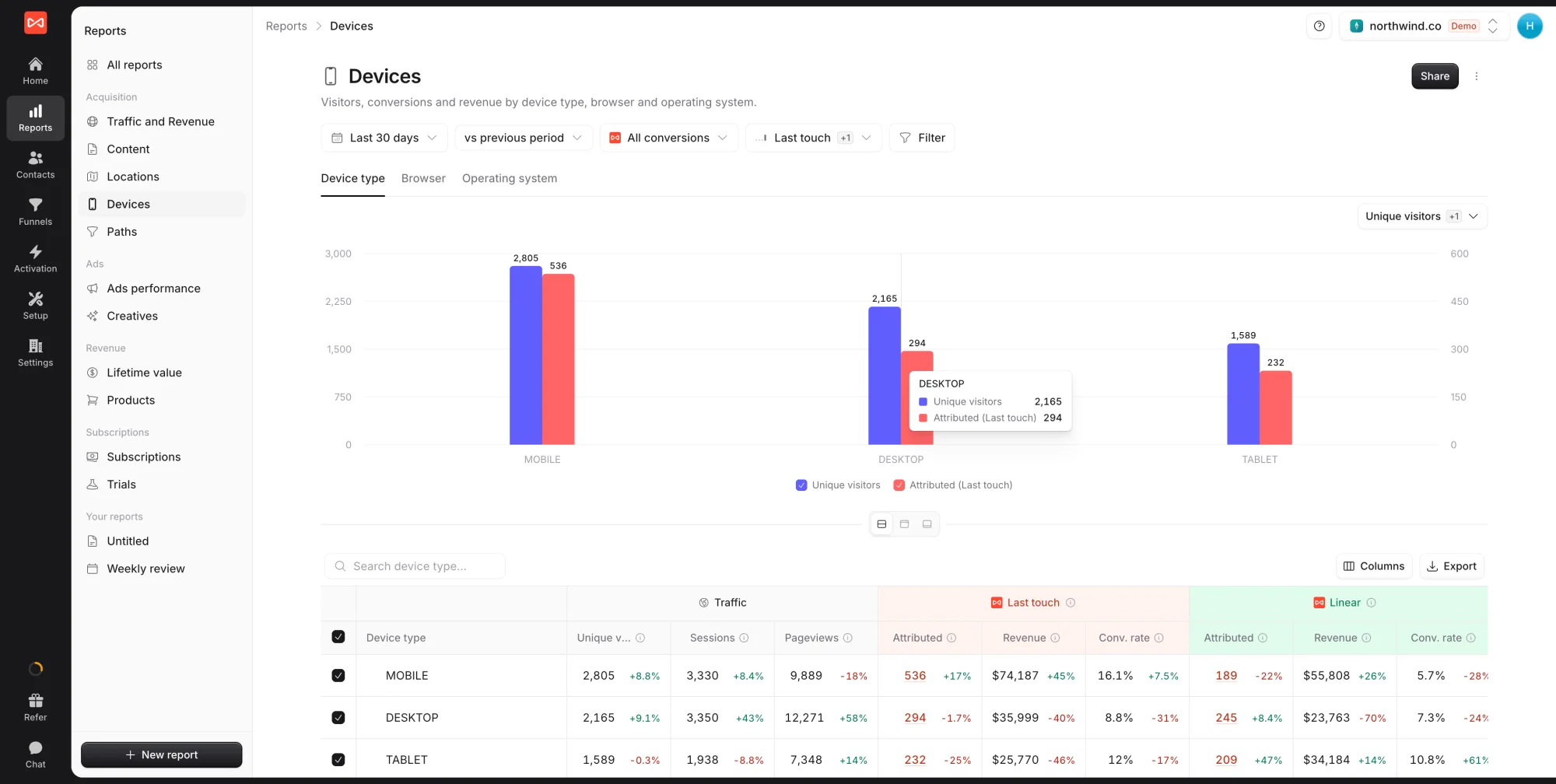
Unlike the Traffic and Content dashboards (which show a time-series chart at the top), the Devices dashboard leads with a donut chart showing the share of conversions by device type. The three segments are Desktop, Tablet, and Mobile, with the total in the centre.
This view answers one question fast: where is most of your conversion volume actually coming from? If the donut is heavily skewed one way (e.g., 70% Mobile), that’s where to invest design and testing effort first.
Above the donut, the metric selector lets you swap what’s being plotted, switch from Conversions to Visitors, Sessions, Pageviews, Conv. Rate, or Revenue. To the right of the metric selector, three icons flip between bar chart, horizontal bar chart, and pie / donut visualisations.
The bar-chart variation is especially useful when comparing two attribution models side by side, the chart will show two bars per device type (one per model) with the conversion-type breakdown stacked inside each.
Step 3: Switch grouping with the tabs
The table area below the chart has three tabs:
- Device Type — Mobile, Desktop, Tablet (the default)
- Browser — Chrome, Safari, Firefox, Edge, Opera, Samsung Internet, etc.
- OS — iOS, Android, macOS, Windows, Linux, ChromeOS, etc.
The chart at the top updates to match the selected tab.
Each row shows the same six metric columns as the other dashboards, scoped to the device segment:
- Visitors with period-over-period change
- Sessions with period-over-period change
- Pageviews with period-over-period change
- Conversions highlighted in orange
- Conv. Rate as a percentage
- Revenue when payment integrations are connected
The Compare toggle on the top-right of the table area adds a period-over-period comparison column so you can see whether mobile conversions grew or shrunk vs the previous period.
Step 4: Spot patterns that matter
A few useful reading patterns once data is on screen:
Mobile dominates volume but underperforms on conversion rate → your mobile experience has friction. Form length, page speed, tap targets, viewport rendering — pick one and run a usability test. Common gap: 30-50% lower conversion rate on mobile vs desktop, which is often fixable with form simplification.
Desktop dominates conversion rate, Mobile dominates pageviews → classic browse-on-phone-buy-on-laptop pattern. Action: don’t optimise the mobile site to “convert”; optimise it to capture the email so you can retarget the visitor across devices. Lead with newsletter signups, sample requests, or saved-cart prompts instead of full checkouts.
Safari converts at meaningfully higher rate than Chrome → your audience skews Apple, which usually correlates with higher willingness-to-pay. Worth a creative test: do iOS visitors see the higher-priced plan first?
iOS conversion rate is meaningfully higher than Android → similar story to Safari vs Chrome. Use the OS tab to confirm. If true, your bidding on Google Ads and Meta can lean more aggressively on iOS.
A specific browser (e.g., Edge) shows surprisingly high conversion → often a B2B signal (corporate Windows users default to Edge). Worth checking whether your B2B campaigns are reaching the right audience.
Step 5: Compare attribution models
The model selector top-right is one of the most useful features on this dashboard for understanding cross-device behaviour. The screenshot below the Filter bar shows what comparing two models at once looks like: when you add a second model (e.g., First Touch alongside Last Touch), the bar chart shows two bars per device type, one per model. The difference is a direct visualisation of cross-device journeys.
If Mobile is significantly taller on the First Touch bar than the Last Touch bar (and Desktop is the opposite), that’s confirmation that your audience starts on a phone and finishes on a laptop. The size of the gap tells you how often.
For more on each model, see Attribution models overview.
Step 6: Switch visualisations
Same toggle as the other dashboards, top-right of the table area, Table / Bar / Pie / Donut. For Devices specifically:
- Donut chart is the natural fit when you have 3-4 device types; instantly readable
- Bar chart is best when comparing two attribution models side by side
- Pie chart is functionally identical to Donut; pick whichever you prefer visually
- Table is best when you need precise numbers across many browsers (Browser tab can have 10+ rows)
Step 7: Export and act
Top-right of the table, click Export to download the visible table as CSV. Typical follow-up actions:
- Mobile UX investment prioritisation — if Mobile has 60% of traffic and 40% of conversions, that’s the next quarter’s biggest design opportunity
- Browser-specific A/B testing — if Safari converts at 1.3x Chrome, set up a test on Chrome that mimics Safari’s conversion flow
- Cross-device retargeting strategy — if First Touch ≠ Last Touch device, build a list of mobile-discovered contacts to retarget on desktop placements
- Bid adjustment — feed the Device-segment conversion data into Google Ads and Meta as device bid adjustments
What’s next
- See which channels drove the traffic: Traffic dashboard
- See which pages on your site converted: Content dashboard
- See where your traffic comes from geographically: Locations dashboard
- See pre-conversion path patterns: Paths dashboard
- Compare attribution models: Attribution models overview
Frequently asked questions
-
How does SourceLoop classify a session as Mobile vs Desktop vs Tablet?
Based on the user-agent string the browser sends with every request. SourceLoop parses it into one of three device categories using a standard device-detection library. Mobile covers smartphones, Desktop covers laptops and desktop computers, Tablet covers iPads, Android tablets, and similar form factors. Edge cases like foldables are categorised by the active screen size at session start.
-
Why does Mobile show high traffic but low conversion rate?
Common reason, mobile visitors have higher intent for short-form content (scrolling, browsing) and lower intent for longer-form actions (filling out a multi-field form, booking a meeting). If your Mobile conversion rate is meaningfully below Desktop, check the form length and friction on mobile, the speed of page load on slow connections, and whether your CTAs are tappable without zooming. Most rate gaps are UX problems, not audience problems.
-
My Browser breakdown shows Chrome at 60-70%. Is that normal?
Yes, very. Chrome's global market share is around 60-65% so most dashboards skew there. What's interesting is the conversion-rate column, if Safari converts 50% better than Chrome at the same volume, that's a signal that iPhone / Mac users are more valuable for your business (often the case for B2B and premium ecommerce). Use that to inform creative and bidding.
-
What does the OS tab show that the Device Type tab doesn't?
Operating system version, not just form factor. The Device Type tab tells you Mobile vs Desktop vs Tablet. The OS tab splits Mobile into iOS vs Android (and version), Desktop into macOS vs Windows vs Linux, Tablet into iPadOS vs Android tablets. Useful when iOS conversion rate differs meaningfully from Android, which is common in B2B SaaS (iOS users skew higher-income) and high-end ecommerce.
-
Can I see conversion data for a specific OS version, like Safari on iOS 17?
Not in the standard view, the OS tab groups by OS family. For OS-version-level analysis, use the Filter button to add an explicit OS version filter, or export the raw data to CSV and pivot in a spreadsheet.
-
How does this dashboard handle cross-device journeys?
A single contact who visits on mobile, then converts on desktop will appear as a Mobile session AND a Desktop session in the table (each session counts under its own device), but as a single Conversion attributed under whichever attribution model you've picked. Under Last Touch, the Desktop session gets the conversion credit. Under First Touch, Mobile does. Switching models is the cleanest way to see how often cross-device behaviour happens.
-
Why does Tablet sometimes have very low traffic in my dashboard?
Tablet is genuinely the smallest segment for most audiences (5-10% of total traffic). For business audiences, it's usually closer to 2-5%. If your Tablet bar barely shows up, that's normal, the dashboard doesn't exclude or downplay it, your audience just doesn't use tablets much.