
How to Read the SourceLoop Content Report
The Content report shows which landing pages start journeys that convert, credited under your attribution models, and which pages people read on the way.
On this page
Most analytics tools tell you which pages get traffic. The Content report tells you which pages start journeys that end in a lead, a booked meeting, or a sale, and which pages people read along the way.
Open Reports in the left sidebar, then Content under Acquisition.
Two questions, two sections
The report is split in two because a page can matter in two different ways.
- Landing pages are where visits begin. Because a landing page is part of how someone found you, it is credited under your attribution models, exactly like a channel on the Traffic and Revenue report.
- Pages viewed covers every page read during a visit, by page, page title, or hostname. Its conversion counts are the conversions that happened on that page, which is how you find your best-converting pricing or contact page.
Step 1: Set the controls
The controls bar works the same way across Reports:
- Pick a date range and a comparison period.
- Use Measuring to count all conversions, conversions by type, or, with a CRM or payment tool connected, contacts by stage, deals, or revenue.
- Tick one or more attribution models. Each gets its own group of columns in the landing page table.
- Add a Filter to narrow to one channel, campaign, country, or device.
Step 2: Find the landing pages that convert
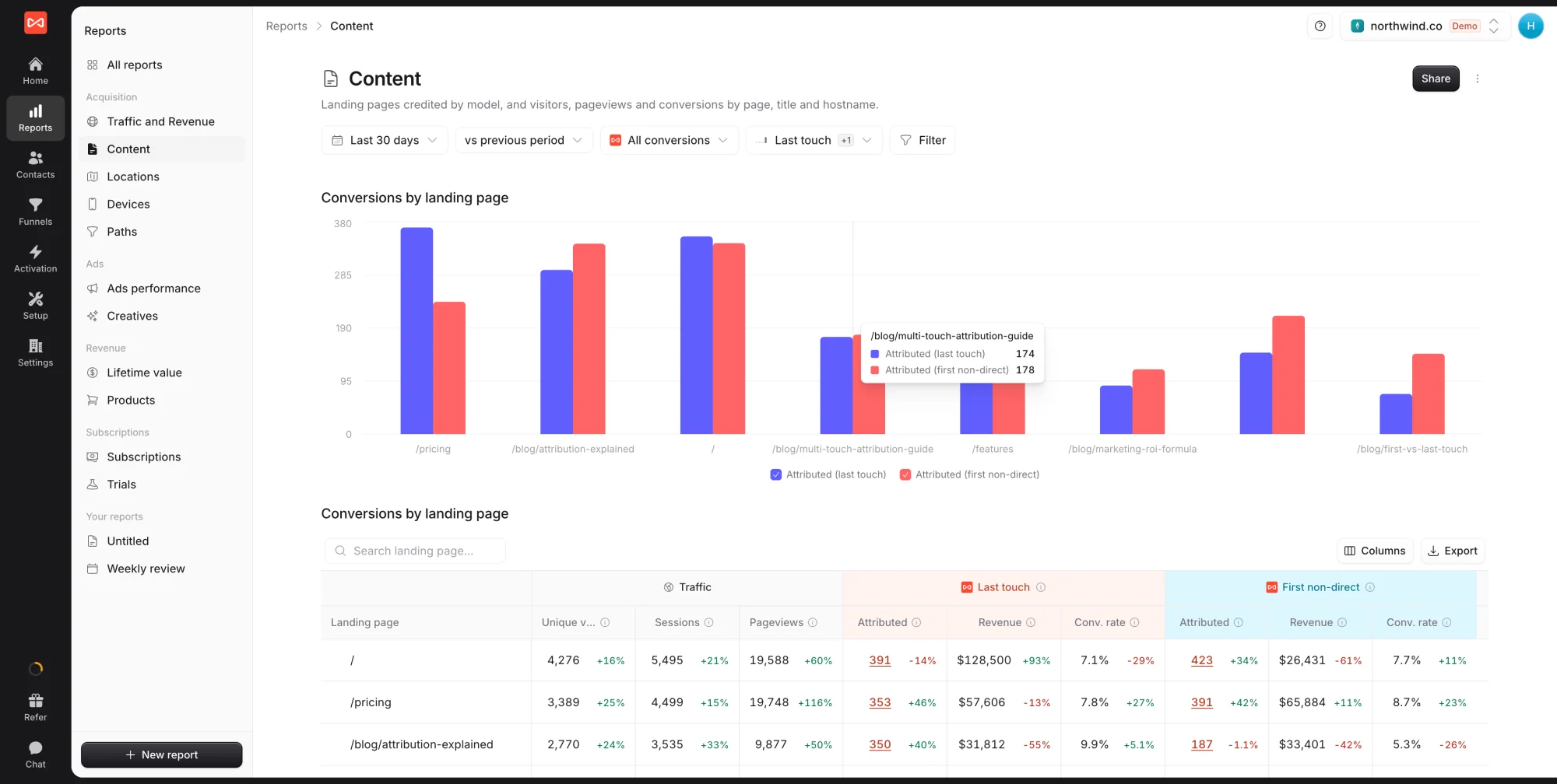
The Landing pages section opens with a bar chart of the pages with the most credited conversions, then the full table.
For each landing page you get visitors, sessions, and pageviews, then per model the Attributed conversions, Revenue, and Conv. rate. Hover over a column header to see exactly how it is worked out.
Good habits here:
- Expand a row to see which channels, campaigns, or countries sent people to that page.
- Click an attributed number to list the people it counts, with how they first found you.
- Compare models. Pages that win under First touch introduce people to you. Pages that win under Last touch close them.
Step 3: Check the pages people read
Below, Pages viewed has three tabs:
- Page: every URL path
- Page title: the same pages grouped by title, handy when one page lives at several URLs
- Hostname: one row per domain or subdomain, useful when you run a blog or docs site on its own subdomain
Tick rows in the table to plot them in the chart above it, so you can compare a handful of pages over time.
Step 4: Export or share
- Export above a table downloads its rows as a CSV.
- Share creates a link to the live report for a client or teammate outside SourceLoop.
- The menu next to Share turns the report into a PDF or PowerPoint deck, or duplicates it into an editable report of your own.
What’s next
- See the channels behind your best pages: Traffic and Revenue report
- Follow the journeys that pass through them: Paths report
- Learn how each model splits credit: Attribution models explained
Frequently asked questions
-
What's the difference between Landing pages and Pages viewed?
A landing page is the first page of a visit, so it is part of the journey and gets credit under your attribution models, the same way a channel does. Pages viewed lists every page people read during a visit. A page read mid-visit did not bring anyone in, so its conversions are the ones that happened on that page, not credit.
-
Why does a landing page have lots of visitors but no conversions?
Usually because the page attracts people early in their research. Tick Last touch and First touch together. A blog post with no last-touch conversions but plenty of first-touch ones is doing its job by starting journeys that convert later on another page.
-
Can I keep internal pages like /admin or /preview out of the report?
Yes. Open Setup -> Tracking code and add the pages under Exclusions. Choose Don't track to record nothing on them, or Visits only to keep the visits but never count a form submitted there as a lead. The change applies to new visits within a minute.
-
How is this different from Google Analytics' landing page report?
Google Analytics credits the landing page of the session that converted. SourceLoop can credit the page that started the journey weeks earlier, or split credit across every landing page a person arrived on, and it shows the people behind each number.
-
My homepage is the top landing page. Is that a problem?
Not on its own. Direct visitors, branded searches, and people typing your URL all land there. Expand the homepage row by channel to see how much of it is Direct or branded search, and check which other pages lead the list once you set those aside.
-
How fresh is the data?
New visits appear within a few minutes, and conversions show up on the contact within seconds.

 Paid Social


