
How to Read the SourceLoop Traffic and Revenue Report
The Traffic and Revenue report ties every visit, conversion, and dollar of revenue back to the channel, source, and campaign that earned it, under the attribution models you pick.
On this page
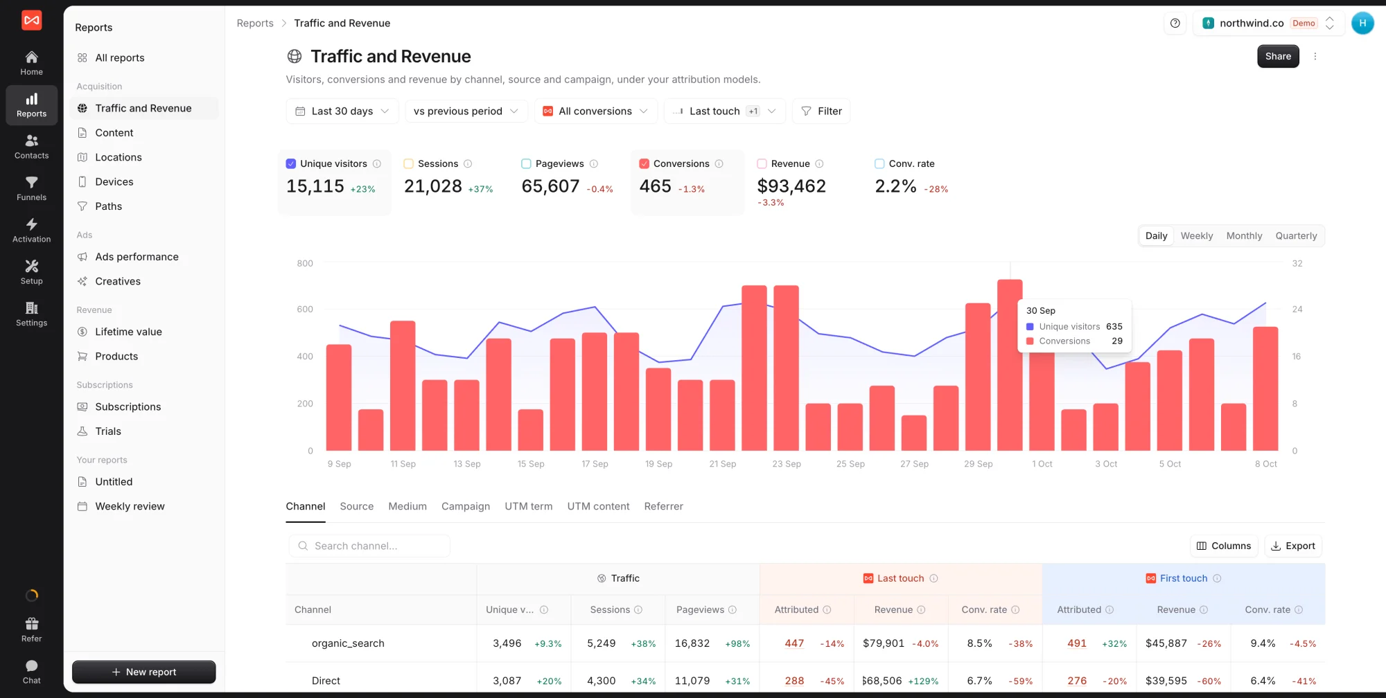
The Traffic and Revenue report is where most SourceLoop questions start. It shows every visit, conversion, and dollar of revenue for the period, then credits each one to the channel, source, and campaign that earned it, under whichever attribution models you choose.
Open it from Reports in the left sidebar. It is the first report under Acquisition, at app.sourceloop.ai/reports/traffic.
What the report answers
- Which channels sent visitors this period, and whether that is up or down on the period before
- Which of those visitors converted, and into what (a form fill, a booked meeting, a call, a purchase)
- How much revenue and pipeline each channel produced, once a payment tool or CRM is connected
- How the credit moves when you look at the same journeys under a different attribution model
For a single person’s journey, go to Contacts. For step-by-step drop-off, build a funnel. This report is the channel-level view of both.
Step 1: Set the controls
The controls bar under the title applies to every number on the page.
- Date range. Defaults to the last 30 days. Pick a rolling period (it keeps moving as days pass) or set a custom range on the calendar.
- Comparison. Defaults to vs previous period, which drives the green and red change figures. Switch to vs previous year for seasonal businesses, or turn comparison off.
- Measuring. Starts on All conversions. This picker decides what the report counts, covered in Step 2.
- Attribution model. Starts on Last touch with First touch added (the “+1”). Tick or untick models to choose which credit columns appear in the table.
- Filter. Narrow the whole report to a country, device, landing page, campaign, or any other field. Conditions stack.
Step 2: Choose what you are measuring
Most teams care about more than form fills. The Measuring picker swaps what every card, chart line, and credited column counts, without changing the traffic numbers.
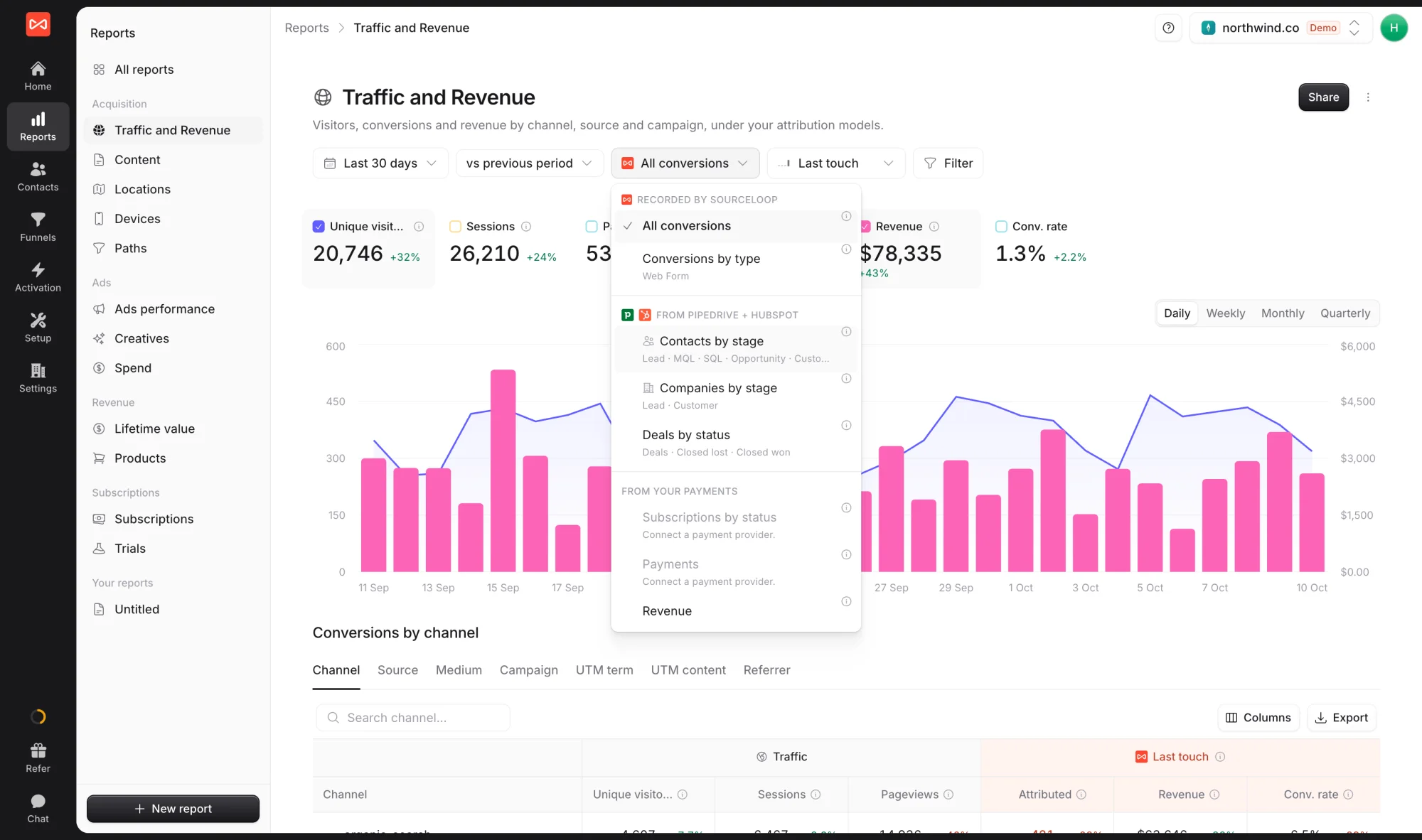
- Recorded by SourceLoop: All conversions, or Conversions by type to give forms, meetings, calls, and chats a column each
- From your CRM: Contacts by stage (Lead, MQL, SQL, Opportunity, Customer), Companies by stage, and Deals by status (open, won, lost)
- From your payments: Subscriptions by status, Payments, and Revenue
Options you have not connected yet are greyed out with a note saying what to connect. Measuring by stage is how you answer “which channel produces SQLs, not just leads?”
Step 3: Read the metric cards and chart
The cards across the top show the period’s totals with their change against the comparison period:
- Unique visitors: distinct people who visited
- Sessions: separate visits, where a new session starts after 30 minutes of inactivity or when someone arrives from a new source
- Pageviews: every page load
- Conversions: what you are measuring, per the Measuring picker
- Revenue: credited revenue, once payments are connected
- Conv. rate: conversions divided by sessions
Tick a card’s checkbox to plot it. The chart holds two metrics at once, each on its own axis, so you can lay conversions over visitors and see whether a traffic spike turned into leads. Counts draw as bars and traffic draws as a line. Use Daily, Weekly, Monthly, or Quarterly above the chart to change the bucket.
Step 4: Read the breakdown table
The table below the chart groups the same numbers by one dimension at a time. The tabs switch the grouping:
- Channel: the bucket each visit is filed under, from your channel definitions
- Source and Medium: the
utm_sourceandutm_mediumvalues, or what SourceLoop worked out from the referrer and click ID - Campaign, UTM term, UTM content: the rest of your UTM tags
- Referrer: the site that linked to you
The columns sit in labelled groups. Traffic holds visitors, sessions, and pageviews. Then each attribution model you picked gets its own colour-coded group with Attributed (credited conversions), Revenue, and Conv. rate. Hover over any column header for a one-line definition.
A few things worth knowing:
- Expand a row to break it down by another dimension inside it, for example Paid search, then Campaign, then Landing page.
- Click a credited number to see the exact people behind it, with their first touch and landing page.
- Columns brings back hidden columns, such as Influenced (every conversion a channel took part in, whatever the model).
- Search filters the rows when the list gets long.
Step 5: Compare attribution models
When someone visits several times before converting, the model decides which visit gets the credit. SourceLoop offers seven:
- Last touch: all credit to the visit they converted on
- First touch: all credit to the visit that first brought them in
- Last non-direct and First non-direct: the same, skipping Direct visits
- Linear: equal credit to every visit
- U-shaped: 40% to the first visit, 40% to the last, the rest split across the middle
- Time decay: more credit to visits closer to the conversion, halving every 7 days
Tick two or three models together to see where they disagree. Channels that win under First touch open journeys. Channels that win under Last touch close them. Attribution models explained goes deeper on when to trust each one.
Step 6: Export, share, or make it your own
- Export above the table downloads the rows you are looking at as a CSV, with your date range, filters, and models applied.
- Share creates a link for a client or anyone outside your workspace. You choose the date range it shows, whether viewers can change it, and whether it needs a password.
- The menu next to Share has Export, which turns the whole report into a PDF or PowerPoint deck, and Duplicate, which makes an editable copy under Your reports.
What’s next
- Understand the seven models in depth: Attribution models explained
- See which landing pages convert: Content report
- Find out where your visitors are: Locations report
- Compare mobile, desktop, and tablet: Devices report
- Read the order of channels in each journey: Paths report
- Put ad spend next to results: Ads performance report
Frequently asked questions
-
What's the difference between the Channel, Source, and Medium tabs?
Channel is the bucket a visit is filed under (Paid search, Organic social, Direct, Email, and so on), decided by SourceLoop's built-in rules plus anything you add in Setup -> Channel mapping. Source and Medium are the literal values behind it, such as google and cpc. Start on Channel to see which kind of marketing works, then switch tabs or expand a row to find the exact source or campaign.
-
How do I compare two attribution models side by side?
Open the model picker in the controls bar and tick a second model. Each model gets its own colour-coded group of columns in the table (Attributed, Revenue, Conv. rate), so you can read Last touch and First touch on the same row.
-
Why do my numbers change when I switch attribution models?
The model decides which visit gets credit when a person came more than once. Last touch credits the visit they converted on, First touch the visit that found them, and Linear splits credit evenly. A channel that looks weak under one model and strong under another is usually opening journeys rather than closing them.
-
Can I report on pipeline or deals instead of form fills?
Yes. The Measuring picker (it starts on All conversions) switches what the whole report counts. Pick Conversions by type to split forms, meetings, and calls, or, once a CRM or payment tool is connected, Contacts by stage, Companies by stage, Deals by status, Subscriptions by status, Payments, or Revenue.
-
Can I change this report's layout or save my own version?
Pre-built reports stay the same for everyone in your workspace. To change one, open the menu next to Share and choose Duplicate. You get an editable copy under Your reports that you can rearrange, extend, and share.
-
My channels show up as Direct for traffic I expected to be attributed. Why?
Direct is where a visit lands when it carries no UTM tags, no click ID, and no recognised referrer. Untagged campaign links, links opened from apps that strip the referrer, and bookmarked URLs are the usual causes. Expand the Direct row by landing page to see where those visitors arrived, then tag the campaigns that point there.
-
How fresh is the data?
Conversions show up on the contact within seconds. Visits and sessions in the report refresh every few minutes. Ad spend and impressions sync from your ad accounts once a day.

 Paid Social


